Saturday, 7 December 2013

Progress


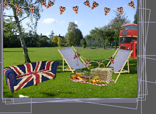
My work on my promo has been bait tricky. i started off with a basic idea using the artists i had research and the pimms website as my inspiration. i wanted to created a Great british garden party/picnic image and make it look at though someone had taken a photo and then checked themselves in on the "pin your pimms" app and the mobile phone was sitting on the deck chair and a pin would pop up from the phone and the viewer would then realise this was what the app does. 

Once i had spoken to kate,andrew and george i had a variety of different comments and was stuck on what idea to finish off with. one comment was that it needed speeding up so the collage was snappy on the screen which i did and i felt this looked a lot better. Another comment was you don't really know what the promo is meant to be promoting so maybe adding in a screen to explain what is was would help. 


so i created this on illustrator and photoshop and then put in through AE i liked the effect it gave switching from the brightly coloured scene to the crisp white and red on the app promotion. using AE on two projects in a row has really helped me to develop my knowledge and skills and I'm happy with the way my promo and my app demonstrations have turned out. 

progress


These are some screenshots from my map on an iPhone and iPad view. the pins on the map represent where other people have checked in and you can click on the pins to see if they have uploaded a photo to their pin. The photo will come up in a white border and you ill have to option to share others people's photos with the social media bar mentioned earlier. 

Thursday, 5 December 2013

Progress


These are some of my worked up files in illustrator and photoshop. i found the when placing an illustrator file into AE is caused the work to pixelate and by putting the illustrator file through photoshop and then creating a PSD it didn't do this. After i found this out a lot of my work has been creating using photoshop. I created my pin in illustrator and was really pleased with the final outcome. i matched the colour of the pin to the union jack background and took down the opacity slightly so it would blend bait bitter and i used the original pimms logo that i created in illustrator using the pen tool and traced the logo. the other font i used was "Foglihten" and "Foglihten no7" 


This is a social media bar i created in photoshop for the bottom of my app screen so while you are going through the app the bar is mainly always there giving you the option to share on social media at all times instead of having to go back to a main menu to do so. i thought this would be a good idea for the younger generation as they would to access their Facebook and twitter quickly and efficiently. 
There is a white background on the bar but i too the opacity down to 50% so the Background on the map was still visible but the bar was noticeable.

Wednesday, 4 December 2013

Progress


i took inspiration from the ios6 and below for my current location box on my app but gave it that smoother cleaner ios7 feel but i still kept the original iPhone box colours as i felt more epode would relate  to those colours and would understand what it was. i created this on illustrated and used the "foglihten" font which i have used throughout my promo and my app demonstrations. 
I'm really happy with the way this turned out and i feel the colour scheme works really well and is effective. I used nude on the map instead of making the map union jack because during my pitch peole had mentioned the union jack on the map might make it to confusing so i replaced the union jack with a nude colour on the map and added the union jack on the background. i decided not to add any street names/roads to my map as i felt people would know where they where checking into and you wouldn't need to know exactly on the map were you were and i am happy with this decision.


These are some of the images i took inspiration from for my map. i used the map above and traced over in illustrator leaving out some of the small tricky parts and i also took away ireland as in my app I've decided not to include ireland as its not a popular drink there. its most popular in the southeast but i didn't want to limit my map that much so i have left it as england and scotland. 

Monday, 2 December 2013

Bulmers app


These are screenshots from the bulmers app which i was really disappointed with. the colour scheme is great to have a bright colour contrasting the coloured bottles instead of the usual white/silver i have been seeing in apps. You can't really do anything with the bulmers it only gives you the chance to scan a code and this is such a let down from such a big brand. they really could of done something more to promote themselves, this is an app i won't be taking inspiration from. 

Sunday, 1 December 2013

Artists

Macay

As an artist, my approach to collage focuses on magical landscapes combined with surreal characters and repetitive patterns, all united by nature.”
MACAY- Macarena YaƱez
i've been looking into artist in some of the illustration books i have to find an art direction. i wanted to create something different to what I've previously done and I came across Macay. I love this style of work and used to create a lot of collage at college but I've been out of practice and i felt this would be a really good direction to go in and i feel it flows with my brand. i love the mixture of bright colours and then the clash of vintage black and white/ sepia. these images really stand out because of the well thought out composition, colour and texture. Looking on the website, the work has a constant theme of patterns and texture though out the work and i want to achieve a successful collage with my promo for my app. 


Peter Blake
"It's using the mystery of Definitely Maybe and running away with it." Blake
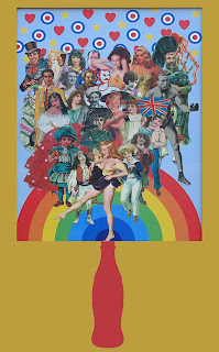
During the late 1950s, Blake became one of the best known British pop artistsOn the Balcony (1955–57) is a significant early work which remains an iconic piece of British Pop Art, showing interest in combining images from pop culture with fine art. The work, which appears to be a collage is wholly painted. This Work by Blake is very similar to Macay but is also incredibly different. The collage uses more of a vintage postcard feel and has less pattern and more human imagery. In most of Blakes work he uses people from all different cultures so also a wide variety  of people in his imagery. One similar aspect is the difference with colour and Black/white images in the work. This is an element i will be adding in my own work.