Tuesday, 16 April 2013

Graphic Inspiration

                                                         Christina Drejenstam


these illustrations are what i want to achieve with my volcanic illustrations, i've done a few rough sketches all with different media, but ive yet to find the one that works the best. each volcano is going to have its own illustration and on the ibook the illustration will be interactive with small pop out's giving you more information and images. the ink used in these illustrations is very fine and the watercolour/ watered down acrylic works really well as a contrast. 

My Dead Pony 


these illustration's are similar to the top ones but they use typography integrated with the image which i think looks really effective. my favourite is the second image where the womens hair is being made out of typography. 


David Despau


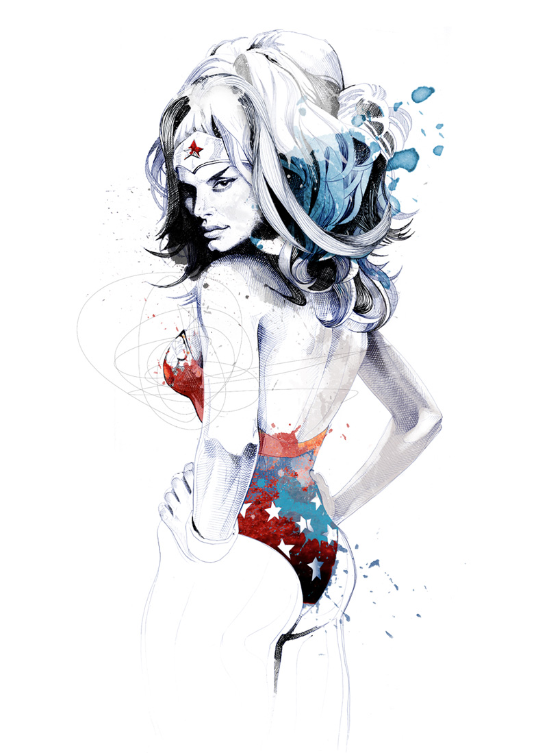
David despau is the designer of the illustrion now 3 book. he uses a mixture of drawing pencils,  ink and black ink pens. the bright colour he has used the in the wonder woman images work really well because he has only accentuated certain parts of the image. i think Despau has the best use of ink/oaint work.  


Wednesday, 10 April 2013

development

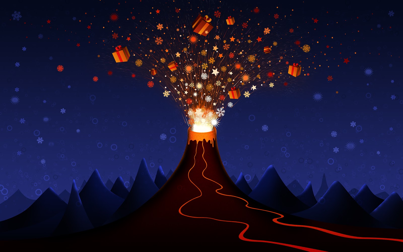
 the top image is the one i am basing my Ibook first page on. i like the illustrative style and its going to give me the chance to build on my illustrator skills. i've started my volcano first and also the lava flow. i've used a radial gradient on the volcano because i'm choosing to use a night sky theme. the gradient on the volcano is reflecting the lava flow where it is lighting up as it travels down the side of the volcano.  ive still got to add the explosive material, and i'm thinking of using my navigation buttons coming out of the volcano so you can click on them.

Tuesday, 2 April 2013

Diagram


Diagram of a volcano. 

website inspiration

http://2012.buildconf.com

this is a website for a yearly web design convention in ireland. i like the simple 2/3 colour pallette and also the patterend banner that locks on the screen when you move down the page. the black banners at the top and the bottom of the page break down the red strip at the top of the page. i like the use of images as the navigation instead of just words and i would like to do this for my website and have the images of volcanoes as the navigation.

Logo Design

this is my finished logo for wonders of nature volcano. i wanted to keep my logo simple but also slightly different which is why only the lava has any colour, everything elce is greyscale. im happy with the final outcome, as i played around with different "ash clouds" but found the straight cloud looked the best. 

Tuesday, 19 March 2013

Typography choices for my website


these are some fonts i found on font squirrel. i think the 1942 report typewriter font for headings and descriptions of photos, the Aaargh font for the content text (like the paragraphs) and the Stardos Stencil as my title text. 

Monday, 18 March 2013

Volcano games for website and Ibook


these are 2 different games i have found for volcanoes. with these games you can build your own volcano and watch it erupt, and also find out information about different types of volcano, looking inside a volcano and key words pop up to teach you about the eruption. the "volcano explorer" game pictured bottom is the more educational and more exciting game, the volcano you build is more realistic than the top game. and there is information all over.