Thursday, 31 October 2013
animation
my animation is based on the life and dreams of a carrot, i created my carrot in illustrator and then used a gradient effect to create some 3dness so they stood out. i then created 2 different stalks for the carrots so they looked more real. one carrot has tall thin stalks and the others have a cloud shaped stalk. i've also added some "stripes" across the carrots to create the natural rings you see on carrots. on the bag I've taken the oppacity down on the date and then added an out of date sign in bright red so that is the first date you see and not the actual date on the bag.
Wednesday, 30 October 2013
Adobe after effects
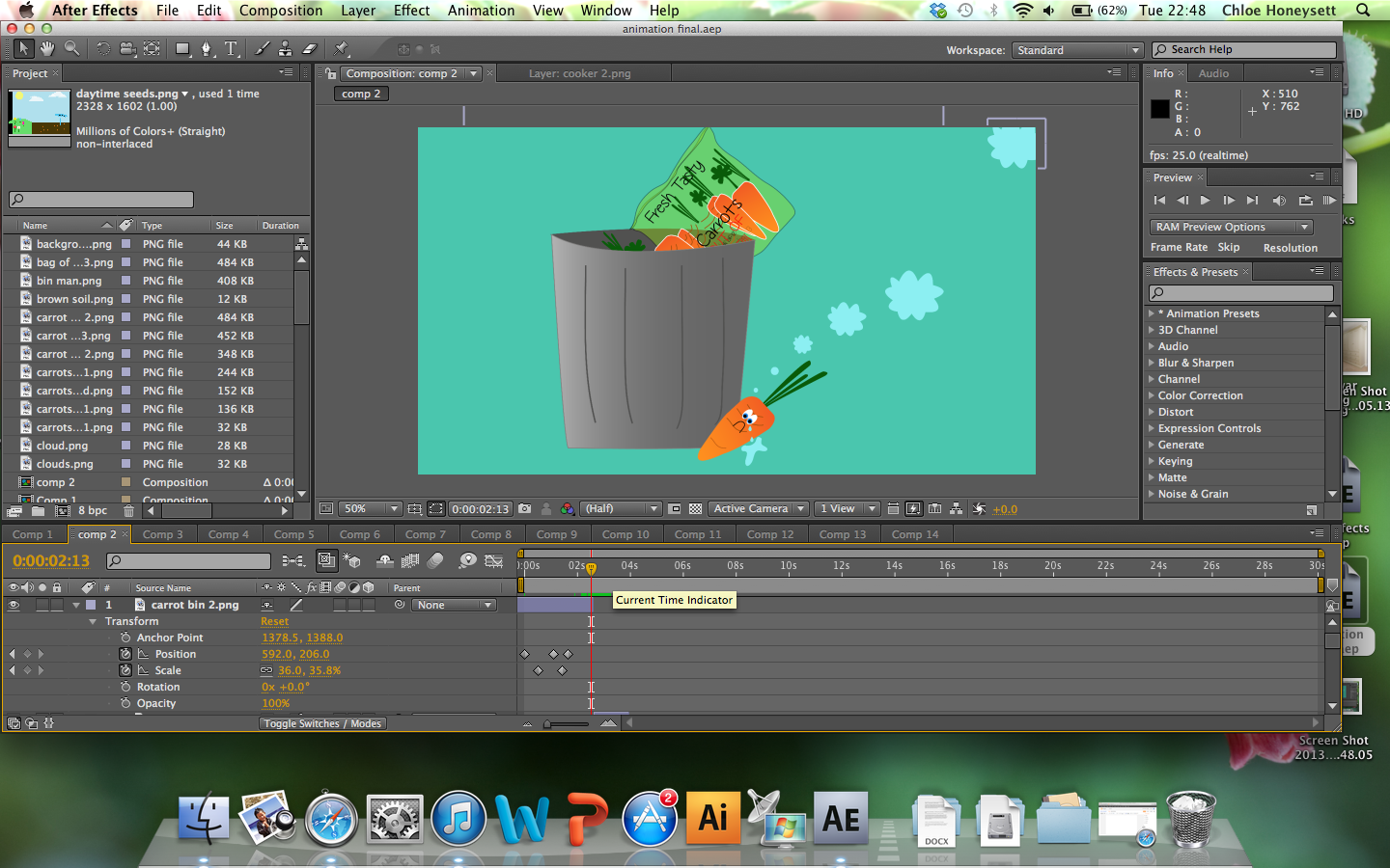
Creating my animation in AE has been really challenging for me as i have never used it before and i needed a lot of help and tuition from other students and also looking on youtube for tutorials. i found the software difficult to use on the first few times and i have stuck to the basic animation for mine as i didn't want to confuse myself to much and ruin what i had already achieved. although i have been experimenting with the transition tools well.
in my animation i decided i wanted to create a carrot that was dreaming about the life it should of lived so in the begging i had to try and create thought bubbles that looked as though you were being taken into the carrots dream. i did this but creating one cloud in illustrator and then exporting it as a png at 300dpi. i then placed it into AE and put it in once along with 4 other static bubble clouds. i took the opacity down and then use the position tool to create the effect that the cloud was moving and expanding and then the cloud took up the entire screen and your being transported into the carrots dream. i think i have achieved this as the transition is smooth but is also interesting enough to keep you watching.
art style
taking inspiration from jessica walshs' edp animation i've used some simple shapes to create my imagery including my clouds which have been made from semi circles and the sun which is created from a full circle. the flowers have been created using 5 circles for the petals and 1circle in the middle for the pollen. The seeds have been made from circles and rectangles for the soil and sky. i think this has created a really effective look for my animation.
Monday, 28 October 2013
slogan
For my animation i decided i would like a slogan to be the last thing you see which would then fade out to the music. i decided that "grow,cook.eat" gave the message i was telling in my animation and it is catchy and rememberable. i found the font on dafont.com and it was called "kg a little swag" the other font i have used for the writing on my vegetable patch sign and the dates of the carrot packaging was "technically but not actually" also found on dafont.com i thought orange would be a good colour for the background as my animation has been based on a carrot but i also felt i might try some other colours such as green and blue because of the recycling point of view and being earth friendly. i've yet to try this to see if it looks any better.
when deciding that i wanted to have a slogan i also came up with "honest,tasty,fresh" but i felt that lacked in what my final message of my animtion was going to be.
Friday, 25 October 2013
Principles of animation
Squash and stretch- Exaggeration, the illusion of weight which can be applied to both body parts and expression. The purpose of which is to give a sense of weight and flexibility to drawn objects. In realistic animation, however, the most important aspect of this principle is the fact that an object's volume does not change when squashed or stretched
Anticipation is used to prepare the audience for an action, and to make the action appear more realistic. The technique can also be used for less physical actions, such as a character looking off-screen to anticipate someone's arrival, or attention focusing on an object that a character is about to pick up
Exaggeration- Exaggeration is an effect especially useful for animation, as perfect imitation of reality can look static and dull in cartoons.The level of exaggeration depends on whether one seeks realism or a particular style, like a caricature or the style of an artist
Staging - This principle is akin to staging as it is known in theatre and film. Its purpose is to direct the audience's attention, and make it clear what is of greatest importance in a scene. This can be done by various means, such as the placement of a character in the frame, the use of light and shadow, and the angle and position of the camera
Timing- Establishes mood and emotion, the more frames the smoother it is. Timing refers to the number of drawings or frames for a given action, which translates to the speed of the action on film
Arcs- All actions follow a path, gravity is a force within the animation world that can be highlighted through the use of arcs. Shapes on a set path curve in a way that introduces a sense of realism. Most natural action tends to follow an arched trajectory, and animation should adhere to this principle by following implied "arcs" for greater realism. This can apply to a limb moving by rotating a joint, or a thrown object moving along a parabolic trajectory. The exception is mechanical movement, which typically moves in straight lines
Slow in Slow out - The movement of the human body, and most other objects, needs time to accelerate and slow down. For this reason, animation looks more realistic if it has more drawings near the beginning and end of an action, emphasizing the extreme poses, and fewer in the middle
Solid drawing- reproduction of life which also generates a realism. The principle of solid drawing means taking into account forms in three-dimensional space, giving them volume and weight.
Appeal- Appeal in a cartoon character corresponds to what would be called charisma in an actor.A character who is appealing is not necessarily sympathetic – villains or monsters can also be appealing – the important thing is that the viewer feels the character is real and interesting
Follow through and overlapping action "Follow through" means that separate parts of a body will continue moving after the character has stopped. "Overlapping action" is the tendency for parts of the body to move at different rates (an arm will move on different timing of the head and so on).
Secondary action- To incorporate secondary actions to make the world feel more organic and real, so whilst the main plot point are the expression and the words the secondary action could be background body movement which really helps to establish the world and the worlds particular set of rules.
Wednesday, 23 October 2013
detailed animatic
I have been working on my illustrator files as well as creating a new more detailed animatic of my animation. i did this because i found it would be more helpful to me to have an idea where my animation was going because i needed a more stable structure and being able to go on to my animatic this way helps me to structure my animation on after effects and make sure all the animations are in the right places. I can also look back on my animatic and see if i can add any additional animation to make it better.
Monday, 21 October 2013
illustrator work
After creating my animatic in final cut pro i started creating my images in adobe illustrator. i've had to cut a few things out of my animatic because i have made it quite long and difficult for the time frame that i've got. in the beginning of my animatic i had a person holding a bag of carrots and it then zoomed in to the expirery date which said out of date, i've cut the person out and gone straight to the bag of carrots. this is because i feel the person is going to be to hard to animate on their own so i've tried to make my animation easier.
I've used simple shapes to create a lot of my designs, including circles for flowers, triangles for carrots, circles for the sun and semi circles for clouds. i've found this to be really restricted way of working but the outcomes have been really good. my art style is there to relate to children so i have bright and pastel colours along with some thick outlines and some thin outlines. during my animatic the class said they liked y song choice and it worked really well for the video. and they also said that i have given myself more work than is necessary.
my chosen fonts have worked really well with my animation being legible and clear.
these are some of the scenes i have decided to cut from my animation purely because of how difficult they would be to animate and would cause me to need to create more illustrator work than i need to for my animation.
I've used simple shapes to create a lot of my designs, including circles for flowers, triangles for carrots, circles for the sun and semi circles for clouds. i've found this to be really restricted way of working but the outcomes have been really good. my art style is there to relate to children so i have bright and pastel colours along with some thick outlines and some thin outlines. during my animatic the class said they liked y song choice and it worked really well for the video. and they also said that i have given myself more work than is necessary.
my chosen fonts have worked really well with my animation being legible and clear.
Subscribe to:
Posts (Atom)
Projects
- June 2014 (4)
- May 2014 (10)
- April 2014 (9)
- March 2014 (21)
- February 2014 (9)
- January 2014 (18)
- December 2013 (7)
- November 2013 (22)
- October 2013 (20)
- June 2013 (3)
- May 2013 (14)
- April 2013 (9)
- March 2013 (9)
- February 2013 (11)
- January 2013 (2)
- December 2012 (4)
- November 2012 (9)
- October 2012 (4)
- September 2012 (5)