- youtube
- flickr
- blogger
- vimeo
- linked in
- google +
Tuesday, 25 September 2012
project
in this project i need to produce a poster using the style of propaganda posters before 1950. we have to link it will social networks and can contain 1 element about the following social networks:
coffee lovers
This is another poster from "just one scarf" design studio's, all of the poster they have are handmade either on the computer or with paper and paints. the coffee rings on the poster look as if someone has used it as a coaster whilst they have been working on it, or someone who saw the poster had it lying around and left their coffee on top. This effect works really well to make the poster casual as well as advertisary. People who drink this coffee feel empowered as if they are helping the soldiers to carry on. they are helping from behind the scenes. the beige/stone font colour has worked well to contrast with the darker browns and teal background. the typography is large in your face bold, strong. the steam coming from the coffee looks as if it as been freshly made ready for you to grab out of the poster and drink.
Be Brief
Twitter as a social networking site only allows you 140 characters to tweet your message, this poster is focusing on this aspect. Also using the propaganda element by adding "The enemy might be listening in" which doesn't even make sense because tweeting is words and not sounds. You don't listen into what people are saying you read what they are saying. This is designed by a design studio called just one scarf. They also design a series of twitter propaganda posters including the one above. The blues on the eagle ( another point the bird is an american eagle symbolising power whereas twitter itself is logo'd with a small bird, maybe meaning you are smaller than you may think) the colours are fading into a darker blue with really enhances the central image, the clash with the orange birds (note not aeroplanes or such normally seen on a propaganda poster) which stay a flat colour all the way through. the background is almost halo-ed around the top of the eagles head again showing the power that the bird symbolises. and then fades into a darker more miserable brown. the text uses a strong large font. which has been watermarked to look old and faded. although the poster is saying be brief i feel there is more of a message such as the large american eagle showing it has more power over the smaller birds circling up above. i love the feel this poster gives you because of its empowering quality.
Monday, 24 September 2012
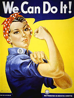
We Can Do It
this is an american propaganda poster designed by J. Howard Miller in 1943. He was hired by Westinghouse electric's internal commitee, through an agency to create a series of posters to inspire their workers to work harder. In total 43 posters where designed and where displayed amongst the factory walls in pittsburg, pennslyvania and the midwest. 1,800 copies where printed on this poster. the first showing was on february 15th 1943 and was on the factory walls for only 2 weeks.
image found on google images http://theaverageconsumer.com/2012/09/labor-day/
this image is relating to the workers that were already working in the factories at the time because they were only shown in the factory walls. its aiming to inspire the workers to work harder.
The Redolution
I found this poster on: http://www.ibelieveinadv.com/2008/02/mms-orange-green-yellow-blue/
It's a poster advertising a competition in australia. This poster is trying to introduce a humorous reaction from the audience instead of a strong emotional reaction like those of the original propaganda posters. the design is meant to influence people to enter into the competition, also making it feel of more importance. This poster is one of a series but i feel is the one that works the best because it is achieving its goal of looking like a propaganda poster. It was advertised through the following advertising agency:
Advertising Agency : Clemenger BBDO, Melbourne, Australia
Executive Creative Director : James McGrath
Creative Directors: Emma Hill, Cameron Hoelter
Art Directors: Gus Johnston, Russel Fox
Copywriters: Paul Reardon, Ant White
Agency Producer: Robin Bowles
Account Managers: Ricci Meldrum, Sarah Galbraith
Subscribe to:
Comments (Atom)
Projects
- June 2014 (4)
- May 2014 (10)
- April 2014 (9)
- March 2014 (21)
- February 2014 (9)
- January 2014 (18)
- December 2013 (7)
- November 2013 (22)
- October 2013 (20)
- June 2013 (3)
- May 2013 (14)
- April 2013 (9)
- March 2013 (9)
- February 2013 (11)
- January 2013 (2)
- December 2012 (4)
- November 2012 (9)
- October 2012 (4)
- September 2012 (5)


