Saturday, 30 November 2013

Absolute vodka (Drinkspiration)


This is an app produced by absolute vodka. The one thing i like about this app best is that instead of trying to promote just the brand themselves they have created an entirely new brand with their app. it shows you what you will need to make specific drinks and also gives you an illustrated step-by-step guide on how to make the drinks. their is also a section to be able to share what you have found/made on your social media. 

I like the search list that they have already given you which has quite a lot of drinks on it for a free app. the variety of drinks all include absolute vodka so they are still promoting themselves well and this app works well on its own too. its similar to the carling app because it has the minimal colour scheme and minimal layout. this works really well on smaller screens so working on apps I'm looking at these for inspiration.

Thursday, 28 November 2013

Carling app


These are some screenshots from the carling app some of the things i liked about the app where
  •  clean cut lines
  • minimal colour scheme
  • well branded
  • consistant theme throughout

some of the things i didn't like about the app:

  • boring
  • the game and beer don't focus with your phone properly and are to fast
  • there isn't much to it.

This carling app works wells to promote carling and drinking in bars but it doesn't do well promoting the drink itself. its almost as though they couldn't think of anything else to make so they made 2 little games. i was disappointed with this app once i had used it.  

Wednesday, 27 November 2013

Work so far


This is a background image i have been layering up on photoshop for my promo video. i've decided to use a cut and stick style of work as i feel this works really well with the advertisement i am going with. as i'm placing pins on a map and layering them i thought this style would work for my promo. i'm using the same song for my promo as i am my short animation of my app. i've used alot of british themse, bunting, union jack sofa, union jack cube and a telephone box. these elements work really well and i'm pleased with the image. i found alot of my images on google and pulled them into photoshop and used the magic wand tool to get rid of the background and to keep a fine line around the image. 

At first i cut out the image and left a 1cm edge around the image, after i had put those together in an animation i noticed they looked really out of place i changed it to have no border and this worked alot better. 

Tuesday, 26 November 2013

Pitch

These are a selection of the slides from my pitch that i did on monday 25th november. 


 i chose pimms as my chosen alcohol and i gave a brief insight into the history of the drink and why i chose it. Its most popular pin the south east so i felt this was a great alcoholic brand to use. 
 i looked at the pimms website to see how they already promote themselves so i could get an idea of the brand identity. their theme is garden party/celebration so this is the idea I'm going for in the app. 
 i showed my app idea and how i have decided to create a map where you can pin yourself having a pimms. the app will use your current location and automatically pin you and you can upload a photo swell. there will be an account page where you can see your previous pins and also you can click on other pins to see other peoples pimms. You will also be able to link your pimms to your friends somewhere else. 
 i look at my visual style and also the orientation of my app. on the iPhone i wanted the app to be portrait but for the iPad i was thinking of making the app landscape. 
 On this slide i was showing how i was starting to create elements of my map and how I've used the union jack background instead of a typical map background. this was a mixed review within the class with people saying it was confusing to know where you are and other people really liking the idea so this map is still in the process of being formed. 
I showed how i started to create my 'pin' for my map and how i have taken influence from the pimms stamp on their website. one of the comments i got was to use the pimms font for the word pimms and i agreed with this so i will carry on playing around with it. 


my pitch mainly received good comments and helpful comments as to how i could change things slightly and also how i could make my map better. I'm going to go back into illustrator to play around with these and hopefully find a better outcome. 

Monday, 25 November 2013

Promotional adverts


Looking at the Honda promotional video you get the hands on, made by real people kind of feel. Honda where trying to achieve a handmade feel to their promotional video and i think they have achieved this really well. They haven't used a soundtrack which is interesting instead they have opted for sound effects and a little voice over. This works really well with the simplicity of the video and you get that clean, sleek feel. I really like this video although this isn't the direction i want to go with on my promo it gives me a good insight into different styles, and how other brands have had successful promo's. 


This is the john lewis advert from 2011, ever since the advert from 2010 people have been anticipating the christmas adverts that john lewis are going to create. these adverts aimed at promoting their brand have become a national phenomenon with people talking, tweeting and face booking about their adverts every christmas, they have succeeded most of all with promoting themselves. They normally use music that isn't well known so they songs becomes more meaningful and flows with the emotion of the advert. 


These are the john lewis adverts from 2010 and 2012. the 2012 advert was the snowmen one and this adverts broke the nations hearts and had that real feel good christmas factor, at first glance you wouldn't have any idea that this is john lewis but the story that it portrayed in its short 30ish seconds kept the viewer watching and also got people really talking about it. the only indication of the brand is when the logo come up right at the end of the advert. This was their most successful advert to date. 


Here is one of the Aldi adverts that has been a talking point throughout the year for their clever, funny puns on normal supermarket products. Aldi is becoming one of the big supermarkets now because of their constantly low prices and they don't sell ANY named brands only their own brand so they make more profit too. This advert was one of the funniest in my opinion and it works really well. Having the prices clearly labelled in yellow draws the viewers eye to the savings they could be making which is why this is also a successful promotional advert. 


Saturday, 23 November 2013

User experience research

"Good iPad apps are about simplicity and doing a few things well. This means you have to be selective about the functionality you include and not throw in the kitchen sink."

"Also, don’t provide a button for every control the user might need to accomplish their goal. Think about what the user can infer about the UI through gesture."

"Crazy, spinny, eye-catching interactions are fine for one-hit wonders and games. But stick with standard navigation for frequently used apps, such as news readers. If you do want to do something innovative, make sure it supports the task at hand and is extremely usable."


"People tend to rest their thumb near the top left when holding an iPad, so putting the button there is easiest because then people wouldn’t have to change their grip. Also, Zite enables you to click anywhere on the screen outside of the article to close it, which makes for a nice flexible gesture. Similarly, the New York Times enables you to pinch an article to close it and return to the home page, which is even better, especially because the controls disappear once an article has been open for a few seconds — although a one-finger gesture closer to the top left would have worked better, because the two-finger gesture would probably require the user to change their grip.
Be mindful of how you yourself use features, and notice when something is usable and when you have to move your hand awkwardly or do something that disrupts your flow."


i found this article on smashing magazine when was researching the best usability for iPad and iPhone. this article was all about how to create an app that gives the best usability for the user and i have taken out a few key points that i thought where to most important and most relevant for my research. reading this article has helped me to decide that  need to keep my navigation simple. On the iPad i was thinking about having a landscape design so having the navigation on the top right/left of the screen would be best placed as when your holding the iPad your hand would be at the top. I want to create the best UX for the user. 

gestures

because i am creating an idea for an app i needed to look into the iPhone/ipad gestures that could work on my app. 

Gestures

Swipe,- a left to right finger swipe
Drag,-holding and dragging
Scroll - down swipe movement
Flick- fast downward swipe flicks pages down
Tap- select
Pinch- zoom in and out

https://discussions.apple.com/thread/2747299 

as my app is a map i think the only gestures i am going to need are tap and pinch. Because I'm not creating a game i won't need to look into the other gestures as mine is kept simple. on the map the only feature you have is to zoom in and out and this is all you need.  

Friday, 22 November 2013

specs.

i've been thinking about the sizes of the iPad and iPhone and as the phone and iPads have changed sizes because of the new one that have been relaxed i found the specs for those ones first. most people like to have to latest  product so i chose to look at the latests models spec. i won't be making the app so its not that important but its still a good thing to be aware off. 

The iPhone 5 specs: 1136 by 640 with a 326 ppi resolution

The iPad Air- 2048 by 1536 with a 264 ppi resolution

http://www.apple.com/uk/iphone-5s/specs/
http://www.apple.com/uk/ipad-air/specs/

Wednesday, 20 November 2013

work in progress

i've created this stamp from the Pimm's website and i want to use this as the top of the "pin" you use to pin yourself on the map. i've stuck to the red/white/blue colour scheme and i think the stamp works really well with the Foglihten no7 font. The original stamp had a crown on the top but i've decided to not include this as it will look to crowded and i prefer it simple. for the white outline on the inside of the circle i drew a circle and then added anchor points and deleted them to create the open circle. 


This is a great british map which i have taken into illustrator and also took an image of the british flag. firstly i tried using a flat image of the union jack then i decided that the fabric effect looked better and did this after. firstly i dropped the map in then i dropped in the union jack flag and placed it underneath the map layer. i then merged layers together and used the magic wand and quick selection tool to create the map with the union jack background. i think this has worked really well and i'm really pleased with this effect. i need to neaten up the outline of the map and it looks quite pixelly but this is the direction i'm going for. 

previous pimms adverts

These are a collection of pimm's adverts. there is one from the 1980's which hasn't used the famous "its pimm's o'clock" slogan as it hadn't been invented then but even in that advert they still show pimm's as a diverse drink that anyone can have and enjoy. the other adverts are made in the last 10 years and show how the slogan has changed the adverts for the better. especially using the typical british theme. pimms is most popular in the south of Britain because of london wimbledon, polo, ascot and other high society events. i like the style of the newer adverts as they have that truly british feel and this theme is one i want to incorporate all the way through my app. i want to use the union jack as my main focus point with a map of Britain. In some of the adverts you get the main character as really dopey and typical british ignoring whats going on around them and inviting the men to have a drink with him whilst they are trying to hide loads of money. its the stiff upper lip attitude that is associated with british people. Another with the main character barging in to  a rave and trying to join in but it obviously isn't working for him os inviting everyone to share his pimm's. in all of the adverts he is carrying his wicker picnic basket which is also seen as a british pastime, so they have also kept all the features in the theme. 


music research

i've been looking for music that catches the 1950's era of great Britain. I wanted a mix of british/ new orleans kind of music. speaking to andrew he showed me kenny ball and the jazzmen and i instantly knew this was the kind of music i wanted for my animation. it goes with the theme of Pimm's thats i'm going for. i've been looking through a lot of their music recently and haven't decided completely which one i want to use. the first video is by a different artist to show the contrast of music i was looking into and i didn't like this much. 


Monday, 18 November 2013

visual style/ alcohol adverts


i started looking at existing alcohol adverts and found the smirnoff one. the couple walking down the corridor look really innocent as to what they are about to walk into. when they enter the bar it all turns poisonous, with snakes piecing the apples into the glass and pouring the vodka. so it plays on the name of the drink by using the snake bite. i think this advert works really well with what it is trying to achieve. the viewer feels that drinking this drink is going to make you powerful and vicious. 


this is an advert for magners cider. it shows the farmer with his beard of bee's and shows him walking through the streets and people recognising him and trying to keep away from the bee's. the advert is trying to show that the cider is all natural products all healthy and locally made for you to enjoy. Its made in Britain aswell so gives you that proud to be british feeling. 


This is an advert for stella artios and shows a simple man walking past a waitress in a fancy resturant. he looks as though he is staring at the women and as a viewer you feel their maybe a small love story to the advert. the man then goes on to work all sorts of jobs to make himself some money. he eventually has enough money to go into the restaurant wearing a fancy suit and the viewer see's him walk straight up to the waitress an her gush for him to walk straight past to order a stella artios and he sits down enjoying his drink.  this advert is a play on emotions and has a background story of whatever job you work you can enjoy a stella at the end of the day.


This is an advert for chocolate baileys it shows clouds of luxurious silky materials flowing over and through eachother to give that smooth silky look and then has dark and beige fabrics mixing to create the baileys mixing with the rich chocolate. it looks smooth and enticing to the viewer. 

Music research


looking through music that is going to go in to my short 15 second animation i have found the jungle book song which goes with the whole british/new orleans summertime feel i was going for. i like the chorus part of the song which is long enough for me to use to show how my app works. the song is really upbeat and happy and matches the original advertisments of pimms with there pimm's o'clock adverts. 

Wednesday, 13 November 2013

Pimms website

I've chosen to do Pimms as my alcohol brand that i am going to promote but first i wanted to have a look on their website to see how they already advertise themselves. 

The adverts that stick in your head the most are the "it's pimms o'clock" adverts where its made to look very british and summery and everyone can enjoy a glass off pimms. i wanted to use this best of british theme as the key theme to my app. 


These are screen shots from the pimm's website, the first one shows the entry screen and you have to put your date of birth in first to tell the website you are of a legal age to access this site, another reason they do this is if they find people using their website without being the legal age they wont get in trouble because the user would of lied about their age. Once you get into the website you can see the background image has a british summertime/picnic/party feel. the union jacks set this scene of well to go with my british theme. and the london red bus also promotes it directly with the south/ southeast of britain. The key colour themes seem to be red/green/blue and i want to keep the same theme colours in my app. 


This stamp is seen on the top right of the screen and it shows their famous slogan "it's pimm's o'clock!" i like the look of this stamp and i'm thinking of doing a map of great Britain for my app and maybe using this stamp as a marker where people have marked themselves. i might change the red background to green and the map is going to be the union jack flag but i will wait until i start the design process before i start deciding this. 

alcohol research - pimms


Pimm, a farmer's son from Kent, became the owner of an oyster bar in the City of London, near the Bank of England. He offered the tonic (a gin-based drink containing a secret mixture of herbs and liqueurs) as an aid to digestion, serving it in a small tankard known as a "No. 1 Cup", hence its subsequent name. Pimm's began large-scale production in 1851 to keep up with sales to other bars. The distillery began selling it commercially in 1859 using hawkers on bicycles. In 1865, Pimm sold the business and the right to use his name to Frederick Sawyer. In 1880, the business was acquired by future Lord Mayor of London Horatio Davies, and a chain of Pimm's Oyster Houses was franchised in 1887.
Over the years, Pimm's extended their range, using other spirits as bases for new "cups". In 1851, Pimm's No. 2 Cup and Pimm's No. 3 Cup were introduced. After World War II, Pimm's No. 4 Cup was invented, followed by Pimm's No. 5 Cup and Pimm's No. 6 Cup in the 1960s.
The brand fell on hard times in the 1970s and 1980s. The Oyster House chain was sold and Pimm's Cup products Nos. 2 to 5 were phased out due to reduced demand in 1970 after new owners The Distillers Company had taken control. The Distillers Company was subsequently purchased by Guinness plc in 1986 and Pimm's became part of Diageo when Guinness and Grand Metropolitan merged in 1997. In 2005, Pimm's introduced Pimm's Winter Cup, which consists of Pimm's No. 3 Cup (the brandy-based variant) infused with spices and orange peel.

Pimm's is most popular in England, particularly southern England. It is one of the two staple drinks at the Wimbledon tennis tournament, the Chelsea Flower Show, the Henley Royal Regatta and the Glyndebourne Festival Opera – the other being Champagne. A Pimm's is also the standard cocktail at British and American polo matches. It is also extremely popular at the summer garden parties of British universities.


There are seven Pimm's products, all of which are fruit cups, only Cups Nos. 1, 3 and 6 are still available at present. The essential difference among them is the base alcohol used to produce them


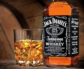
jack daniels - alcohol research

Scholars debate the beginnings of vodka, and it is a problematic and contentious issue due to little historical material available on the subject of the origins of the drink. According to some sources, first production of vodka took place in the area of today's Russia in the late 9th century; however, some argue that it may have happened even earlier in Poland in the 8th century. According to the Gin and Vodka Association (GVA),] the first distillery was documented over three hundred years later at Khlynovsk as reported in the Vyatka Chronicle of 1174. For many centuries, beverages differed significantly compared to the vodka of today, as the spirit at that time had a different flavor, color and smell, and was originally used as medicine.


Jack Daniel's whiskey is filtered through sugar maple charcoal in large wooden vats prior to aging, which is an extra step that is not used in making most Bourbon whiskey, and the company claims that this makes the product different from Bourbon. However, Tennessee whiskey is required to be "a straight Bourbon Whiskey" under terms of the North American Free Trade Agreement and Canadian law,
After being used for the aging of Jack Daniel's whiskey, some of the barrels are sold to McIlhenny Company of Avery Island, Louisiana, for production of Tabasco sauce and to both the Mount Gay Rum company of Barbados and Appleton Estate of Jamaica for use in the aging process of their distinctively flavored rums.

According to the Jack Daniel's website, founder Jasper Newton "Jack" Daniel was born in September 1850, although seemingly no one knows the exact date because the birth records were destroyed in a courthouse fire.ack died in 1911 from blood poisoning which started from an infection. The infection allegedly began in one of his toes, which Daniel injured one early morning at work by kicking his safe in anger when he could not get it open (he was said to always have had trouble remembering the combination).


Jack Daniel never married and did not have any children. However, he took his favorite nephew, Lem Motlow, under his wing. Lem was very skilled with numbers, and was soon doing all of the distillery's bookkeeping. In 1907, due to failing health, Jack Daniel gave the distillery to Motlow, who then bequeathed the distillery to his children, Robert, Reagor, Dan, Conner, and Mary, upon his death in 1947.

Alcohol research - vodka


Vodka  is a distilled beverage composed primarily of water and ethanol, sometimes with traces of impurities and flavorings. Vodka is made by the distillation of fermented substances such as grains, potatoes, or sometimes fruits or sugar.
Vodka is traditionally drunk neat in the vodka belt countries of Eastern Europe and around the Baltic Sea. It is also commonly used in cocktails and mixed drinks, such as the Caesar, Bloody Mary, Screwdriver, Sex on the Beach, Moscow Mule, White Russian, Black Russian, vodka tonic, and in a vodka martini.


typical brands of vodka include : 
  • Smirnoff
  • Absolute
  • glenns
  • grey goose
  • chekov
  • imperial

Scholars debate the beginnings of vodka, and it is a problematic and contentious issue due to little historical material available on the subject of the origins of the drink.According to some sources, first production of vodka took place in the area of today's Russia in the late 9th century; however, some argue that it may have happened even earlier in Poland in the 8th century.According to the Gin and Vodka Association (GVA) the first distillery was documented over three hundred years later at Khlynovsk as reported in the Vyatka Chronicle of 1174. For many centuries, beverages differed significantly compared to the vodka of today, as the spirit at that time had a different flavor, color and smell, and was originally used as medicine.


Monday, 11 November 2013

alcohol advertisement/animation brief

Today we got set the brief to create an app that promotes an alcoholic drink of my choice. the app can do whatever you want it to as long as it promotes the drink and is informative, entertaining and useful to the user. we also have to produce a 15 second animation which will double as a teaser to the app, and the animation should generate traffic to the app. the Graphic style we choose to go with has to be one that reflects the brand identity and brings it to life. we have to choose a peice of music that will match the animation and will also reflect the brand well. 

looking at alcoholic brands i was thinking originally of a "Best of british" theme and then started looking at british alcohol such a pimms. 

some of the notes i got from reading through the brief where 

what goes in your app  

  • where its made
  • where to find it
  • what to drink/eat it with
  • ratings/social media 
  • linked to a social media site
  • drinks map of the world/UK
  • what drink - strength, who do you drink it with, what it does to you, origin
  • animation: teaser for the app, must generate traffic to the app, focus on branding style


pitch: monday 25th november
crit: monday 9th december
deadline:wednesday 11th december


Monday, 4 November 2013

AE update

 i've been working on AE on my nighttime scene for my garden. i decided to animate it i would create a shooting star along with some of the stars "twinkling"

for the twinkling stars i created single stars in AI and exported them as PNG at 300DPI and placed them onto my night sky and then using the transition tools i used the scale tool. zooming them in then out again in the space of 1 second which creates a pro-longed twinkling effect which i was really pleased with. I original created 3 stars that did this but i felt it was to much to look at so i took one away and was left with 2 twinkly stars which i think works really well. 


I also decided it would look really nice with a shooting star. I used the star PNG from the twinkly stars and used the position tool to make the star swoop across the sky but after creating this i felt it was lacking something so i went into AI and experimented with the Chalk brush tools and created a swoop which i then placed into AE and took the opacity down slightly and after the star had passed the swoop the opacity went back up to look as through the star created it. 

I was really pleased with this simple but effective results and i found creating them really fun. 


Crit

During crit i had to show a static version of my animation due to the software on my computer kept crashing i have since fixed this with updates and a re-install of mavericks system. during crit i got a lot of positive feedback such as 

  • my choice of art styles reflected my target audience well
  • my colour schemes worked well together
  • my font choices suited the theme of my animation
  • the story behind the animation was clever
  • my song choice was well picked
i did have some critical feedback which was 
  • some of the artwork wasn't as good as the rest (looked rushed)
  • the character should have different coloured boots
  • some parts of the animation go on for to long so they need shortening 

i've adressed most of these comments and have looked again and my AI images and i don't understand the comment about the drawing styles being of a high quality and some not, but that is personal preference to other people. 

Saturday, 2 November 2013

AE work


I decided right from the beginning that i wanted a slogan at the end of my animation so the viewer would understand what the message of my animation was. i decided to go for the orange background in the end instead of the green because i felt it looked better and the range goes along with the colour of the carrots that have been the main "character" of my animation. i thought it looked a little bare so i added a small pink flower the grows from the bottom for a small animated feel. the squiggly ends on the end of the typography have a drawn on effect that i think works really well. 


When i was designing the carrots on the hob i thought it would be a good animated idea to create the flames flickering underneath where the carrots where cooking and also to have some of the water boiling over the side of the pan. the carrots inside the pan orate slightly while they are cooking and i did that with the transition tools and just rotated them backwards and forewords to create that. for the flames flickering i used the opacity tool and kept changing it with the anchor points. 

illustrator work

Ive been working in illustrator to create all of my files and imagery. my main character is going to be based on the nhs change 4 life characters with no face/fingers/toes and i have chosen a pale pink colour because its close to skin colour but is friendly towards children. 

this is my main character design and i have kept him all the same colour, including his shoes/feet. he is standing next to a bin putting the bag of carrots in the bin because they date is saying its out of date so naturally he throws the carrots away without checking the vegetables to see if they are still edible.


the animation then zooms into the carrots that has fallen out of the bag and onto the floor looking sad and crying, which the animation then goes into the carrot dreaming about being home grown and cooked up in a casserole, trying to get the message across to younger generations that we should grow sustainable fruit and vegetables at home because when they aren't used they can compose in the soil which will put back the nutrients for the next lot of seeds. 


this show my character standing in his garden about to dig a hole to put the seeds in the soil to start growing his food, this is what follows from the carrot dreaming. i have used some inspiration from jessica walsh with using the simple shapes in my design. The colours have been kept to match my child target audience but they have also been kept as "realistic" so the soil is still brown, the sky blue and the grass green. 

Working on illustrator again has helped me to re-gain some of the practice that i had lost of the summer and i have really enjoyed using it again, Alot of the work i've done for the animation has been freehand drawings although my main characters i traced around with the pen tool to create my character and then created different arms for different angles for him.